1. Design Form
First, I created a sketch of the form I wanted to create. This sketch does nothing for informing the painting process, but instead outlines the form I'm going to create in a strictly sculptural sense (pardon the lack of photo; all my sketchbooks are in a cardboard box somewhere in preparation for the move to NYC).
2. Realize Form
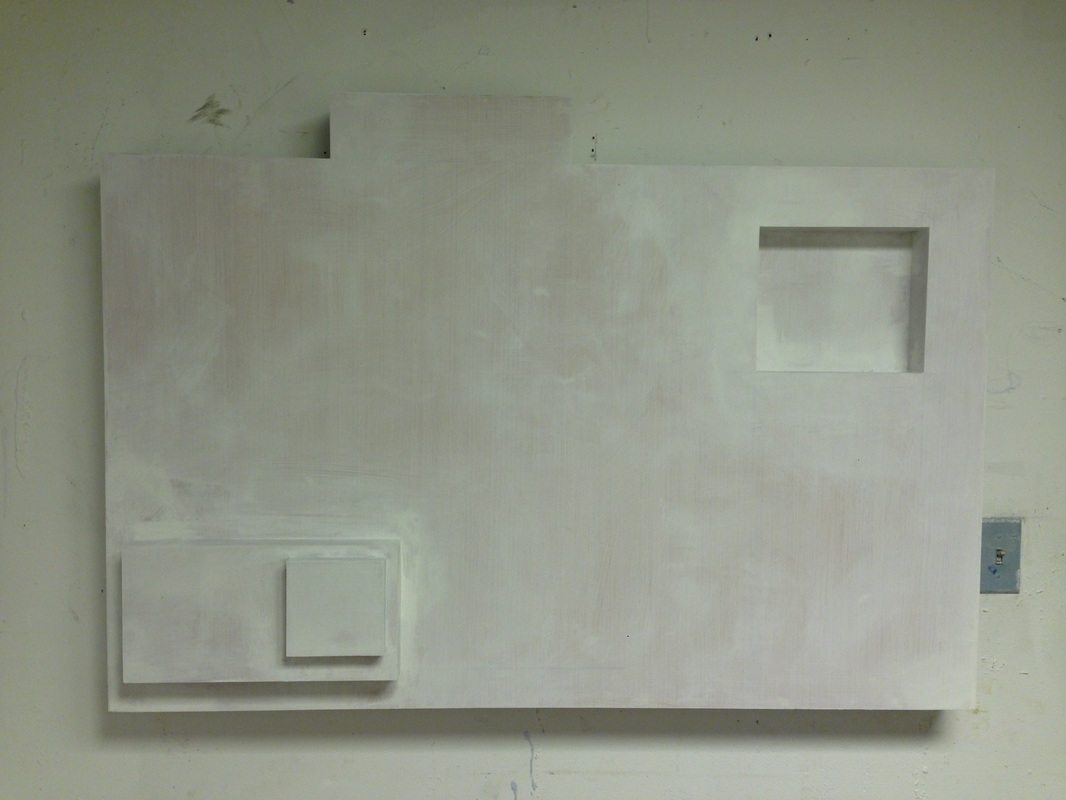
Here is the panel all gessoed and ready to be painted in my studio. The rectangular elements you see both recede (top right) and come forward (bottom left) into space.
3. Begin the Painting Process
Honestly, this piece went smoothly from the beginning. Note that this is NOT always the case. Making a series of art pieces is kind of like having multiple children: some of them seem to obey from the get go, while others are a bit of a struggle. And then you have to find them homes where they will be safe and stop bothering you, but that's a whole other blog entry...
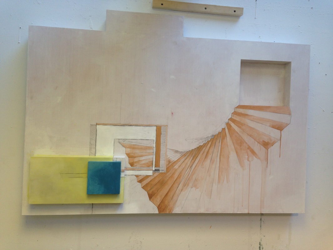 The beginnings of the painting process. I found starting this painting really easy in terms of figuring out the composition, as it already had a preprogrammed composition in the form of 3-dimensional space. As per usual, it felt like there needed to be a ephemeral staircase leading up to the top righthand corner. I actually painted the part in acrylic instead of oil (metallic colors don't really exist in oil). It's important to do any acrylic layers before oil, as things tend to disintegrate if you do the reverse. 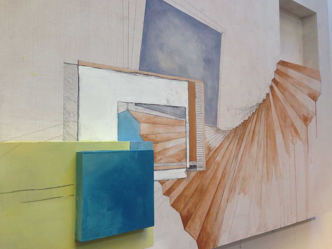 Here's a side view. I enjoyed the connections between the real and illusionistic frames--especially the white rectilinear form framing a miniature composition within a composition. The lines to the right, right before the bronze staircase, are actually retraced with hot glue so that they have a textural, tactile component (not that you're allowed to touch) in person. 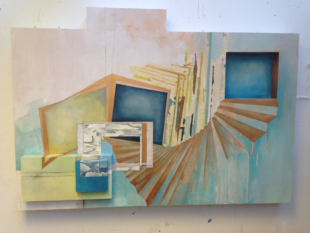 I know this piece seems like a bit of jump, but I think it's because this phase fell into place quite quickly and easily. Here I've added a molding paste and graphite texture to the white rectangle, done a layer of phthalo blue over the previously purple portal, and painted the shadowbox in the upper righthand corner a sky blue (as obviously the destination of the staircase has to be a bluespace. For more on bluespace, see my artist statement). I also added used tape in a mostly vertical fashion, cutting the bottom edge with an exact knife so it perfectly matches the negative shape of the receding staircase. | 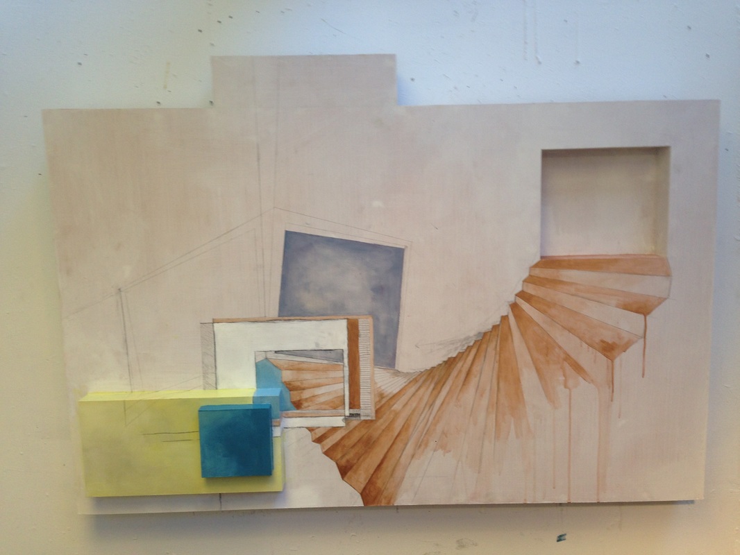 In addition to the purple portal, you can see the faint graphite lines outlining the next phase of the composition. I liked having an in-perspective frame to juxtapose the straight-on view of the white rectilinear element. I was already really excited about this painting at this point. 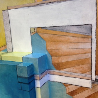 And a detail shot. I really liked how this particular area was coming along--especially that the 3D aspects mimicked a staircase. Made for a nice connection between the literal and the illusory. 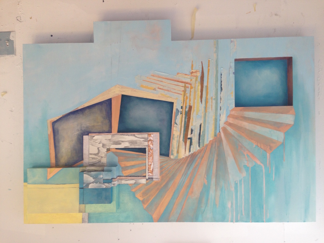 At this point I knew it was time to slow down and stop adding too many elements to prevent it from getting busy. Nonetheless, the top lefthand corner felt empty. It definitely needed something--albeit something subtle. Here I also added a strip of gold and bronze palette scrapings, or recycled paint. You can see it very faintly in this photo to the right of the molding paste. |
So I added paint drips to the blank-ish area, which I felt resolved the issue. And I almost left it this way. In fact, I was so sure it was finished, I had my good friend Amryn Soldier photograph the piece. What changed things was what often changes things: my advisor, Virginia Derryberry. Virginia engaged me in a conversation that made me think about other possibilities. She got me thinking about pieces: pieces of compositions, pieces of rectangles, pieces of artistic waste in comparison to the whole.
And that’s when it occurred to me: The Farther was practically asking to have smaller pieces added to it. It would be the perfect solution to its pseudo-rectilinear problem—that is, how its barely not a rectangle. As art school will tell you, if you’re going to do something, do it all the way. Either make a perfect rectangle, or make it damn clear you weren’t trying to. Assert your piece in all its non-rectilinear glory.
And that’s when it occurred to me: The Farther was practically asking to have smaller pieces added to it. It would be the perfect solution to its pseudo-rectilinear problem—that is, how its barely not a rectangle. As art school will tell you, if you’re going to do something, do it all the way. Either make a perfect rectangle, or make it damn clear you weren’t trying to. Assert your piece in all its non-rectilinear glory.
4. Reevaluate
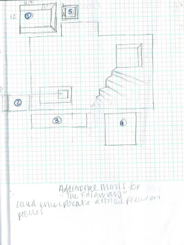 | So I turned to my sketchbook. I ultimately decided to add 5 small pieces--separate panels, but displayed as part of the piece. I determined their general shape and placement while looking at the existing piece. I wanted each additional panel to complement both the sculptural and painted elements of the existing piece. In other words, they needed to make visual sense from a 2-D and 3-D perspective. |
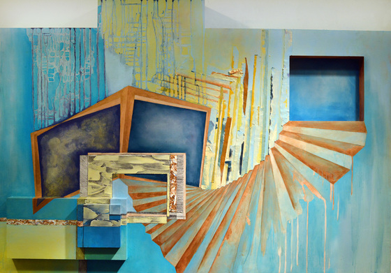
4. The Final Product
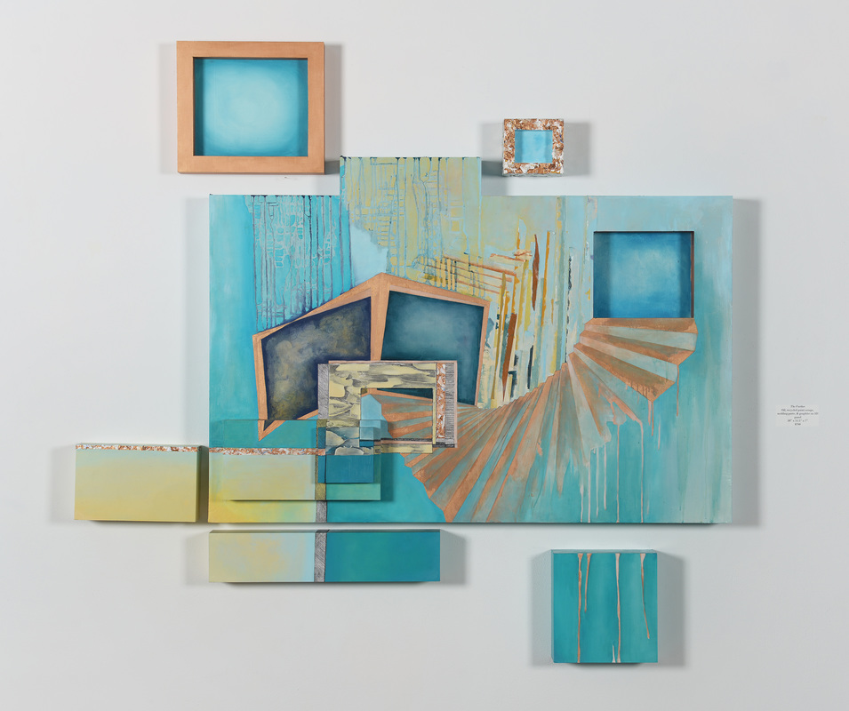
Here hangs the final product in my solo show, Perpetual Pursuit: Painting the Unattainable, in Tucker Cooke Gallery! The top two pieces are actually 3-dimensional, imitating a frame where the outside comes forward into space. This goes conceptually along with the idea of trying to reach a space or idea that remains physically above, out of reach. Their measurements were designed to "tuck" into the rectilinear silhouette the larger panel creates.
The other three pieces continue the composition of the painting, extending golden palette scrapings to the left, the thick graphite line downwards, or continuing the bronze drips against a aquamarine backdrop.
(Bonus points if you noticed that piece #5 ended up moving to the right and down some so it fit in the corner.)
The final product was hung slightly above eye level as to reassure the themes of ascension throughout the show.
See the full features of The Farther here, or the rest of the solo exhibition images here.
 RSS Feed