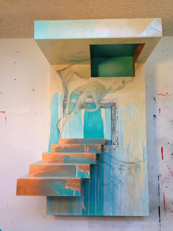
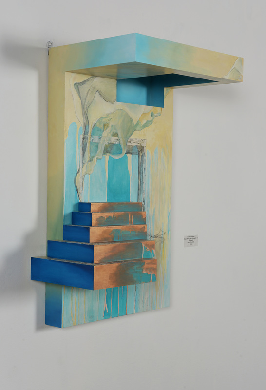
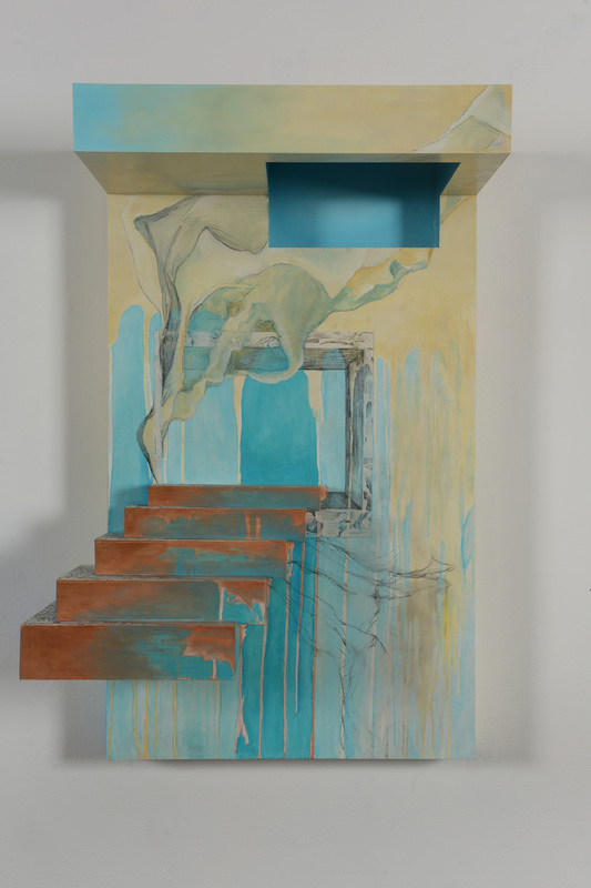
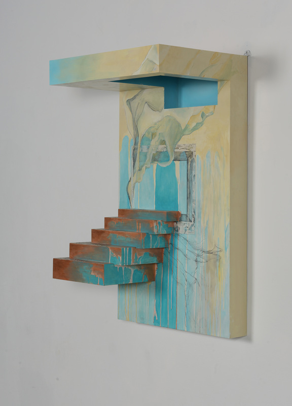
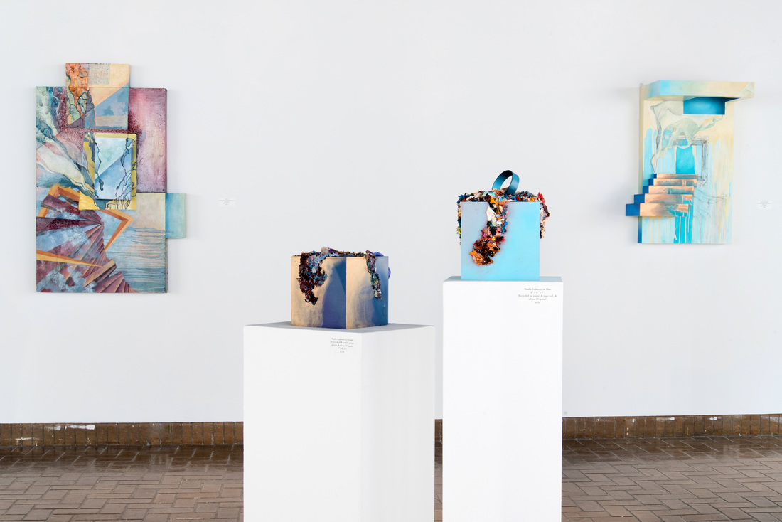
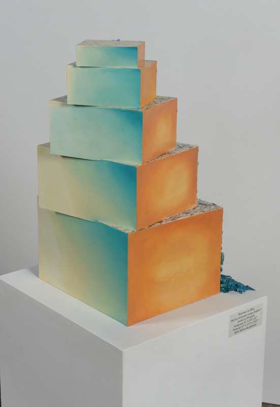
This process study focuses on another cornerstone piece of my BFA portfolio, Perpetual Pursuit: Painting the Unattainable, Land of the Above. The piece is for sale for $700; see the full product detail here.
Land of the Above began with a suggestion from critique. Professors and peers were pushing me to jump more wholeheartedly into the realm of 3D. In short, if you're going to do it, do it right. They said that some of my other pieces felt tentative, and it would be nice to have something more deliberately and obviously in the realm of the third dimension. Here is the process that ensued...
Land of the Above began with a suggestion from critique. Professors and peers were pushing me to jump more wholeheartedly into the realm of 3D. In short, if you're going to do it, do it right. They said that some of my other pieces felt tentative, and it would be nice to have something more deliberately and obviously in the realm of the third dimension. Here is the process that ensued...
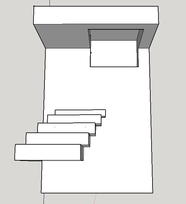 | 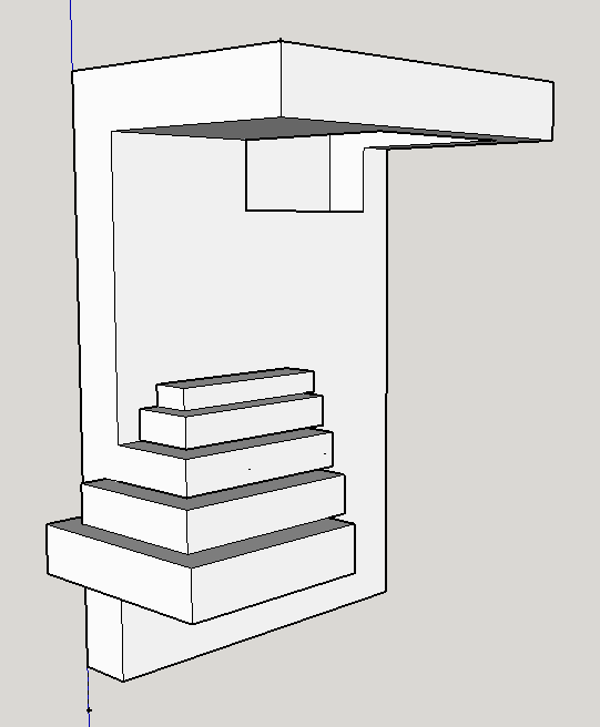 |
1. Make a Model
When I made this design in Sketchup, a 3D modeling software, I barely knew how to use the program. I had taken an architecture class in high school I admittedly payed little attention to, and my Sketchup skills were limited to my shoddy performance over 3 years prior. But I was dead-set on using it, as drawing the form wouldn't really allow me to change my mind and re-evaluate the composition the way I wanted. Sketchup would be much easier... that is, if you know how to use it. Making this admittedly basic form (compared to what Sketchup can do) took hours of frustration and mumbling foul language at the computer. After I finished what you see here, I used proportions to attach numbers to each plane, which ended up being down to fractions of an inch.
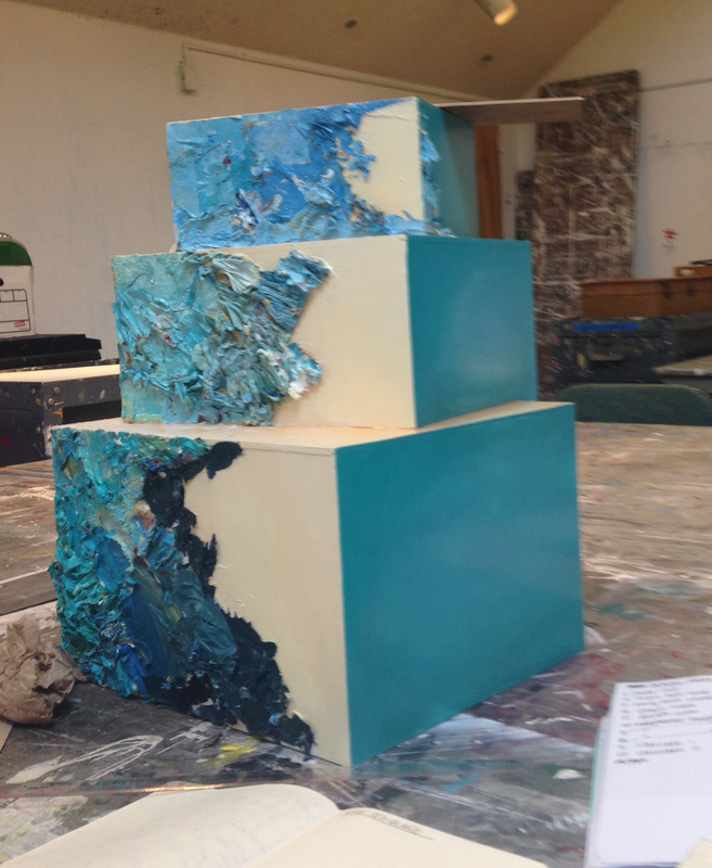
2. Realize the Form
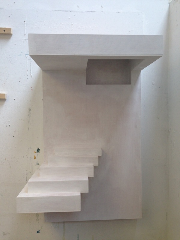 |  |
This is what the form looked like, gessoed but unpainted. It barely fit in my studio, and I had to hang it specially. In order to paint the overhead shadowbox, I had to stand on a chair and turn my head awkwardly skyward, Michelangelo-style.
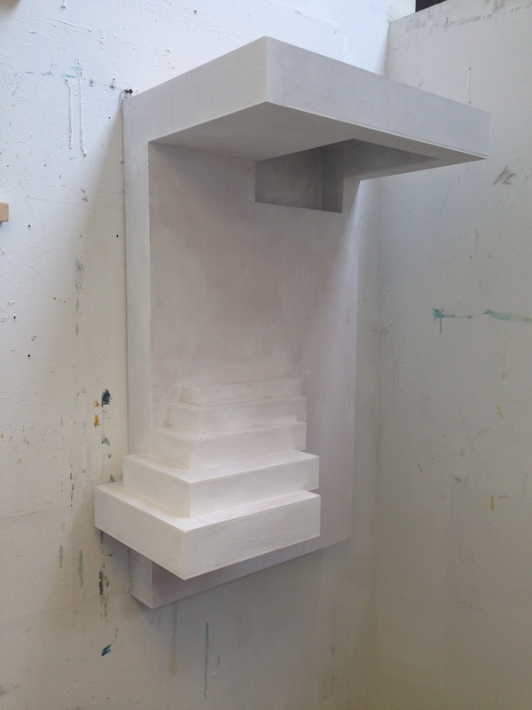
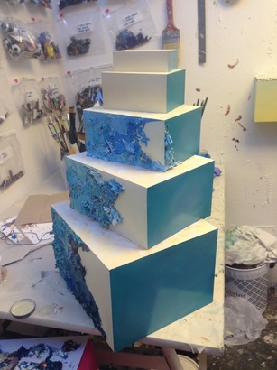
3. Begin the Painting Process
 | 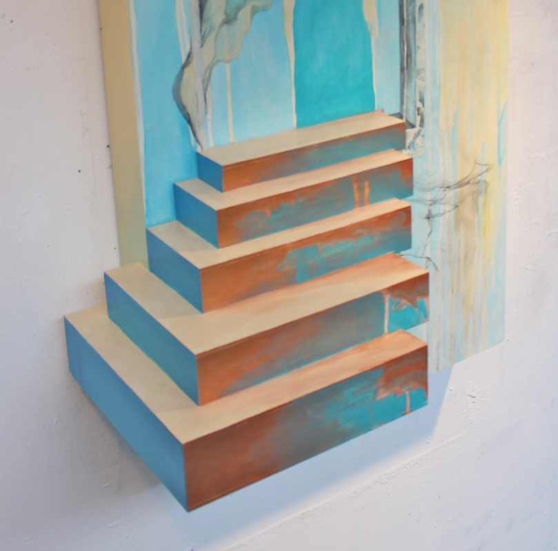 |
I distinctly remember this painting process being a difficult one. Part it could have been that it was crunch time in the semester, but it was more than just that: this was the first "painting" I'd done that, even its its blank-panel stage, already had a composition-- a 3 dimensional one. Even thought the panel didn't have any paint on it, it wasn't really blank. With largely 2 dimensional works, the painting part can speak for itself. After all, that is the main element. But with this piece, I had a hard time not overdoing the painting. I had a hard time stopping. My studio mate and sanity-keeper Louise Thompson begged to me leave the graphite sketches of a curtain-like form you can see to the right of the staircase untreated. I wasn't convinced, but I ended up leaving the painting be. For weeks. Maybe even a month, which I basically never do. But I was stuck.
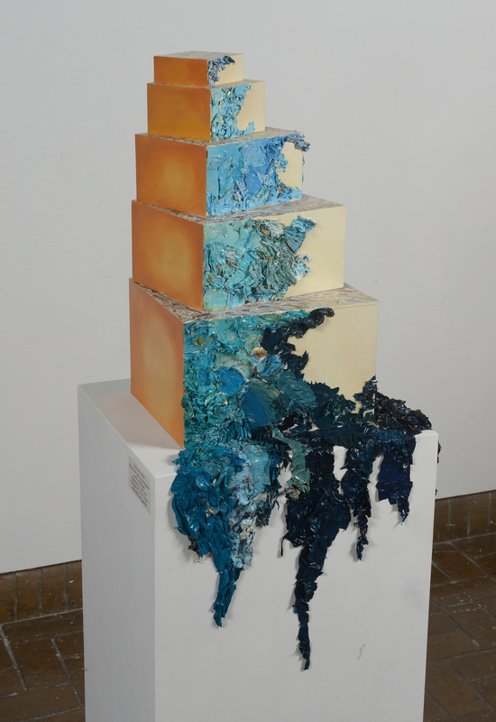
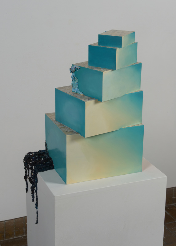
And to make matters worse, I had another, more complicated problem: lighting. The shadowbox, "cutout" form in the upper right hand of the panel looks green, right? Only I had painted it blue. It needed to be blue, as this color is essential to my concept. I wanted the viewer to WANT to access this unreachable (both literally and figuratively) bluespace. Which, frankly, doesn't work if it's green. And it's hard to make something appear to be bright when it's quite literally in shadow. And how are you going to light that plane in the gallery?, everyone asked. I had no idea.
And to make matters worse, I had another, more complicated problem: lighting. The shadowbox, "cutout" form in the upper right hand of the panel looks green, right? Only I had painted it blue. It needed to be blue, as this color is essential to my concept. I wanted the viewer to WANT to access this unreachable (both literally and figuratively) bluespace. Which, frankly, doesn't work if it's green. And it's hard to make something appear to be bright when it's quite literally in shadow. And how are you going to light that plane in the gallery?, everyone asked. I had no idea.
4. Problem Solving
 |  |  |
5. Display
Two crucial things happened in this phase:
- I had to deal with the overhead shadowbox situation. Many ideas were suggested, most of which freaked me out. The scariest involved cutting out the overhead shadowbox altogether (it's made of wood, so this would involve some pretty powerful and precise power tools I did not feel comfortable operating) and replacing it with a sheet of vellum, behind which I could shine a light. Instead, I went with a brilliant suggestion from a classmate, Jen O'Connell. Jen said, "why don't you just paint the shadowbox to look bright?" In other words, overcompensate for the cast shadow by painting the area so bright it ended up looking the way I wanted it to. This is what I ended up doing. If you looked at my palette at the very color I used to paint the overhead shadowbox, it actually looked very different than what you see in the painting. Optical illusions, man.
- As you can see on the leftmost photograph, I added a deep cerulean blue to emphasize the left edge of the staircase and diversify the color palette.
Finally, in the gallery, I hung the piece way above eye level, so the viewer had to look up and into the bluespace. This decision spoke to the work's conceptual ties with ascension, one of the few constants that remained unchanged in the execution of the piece.
 RSS Feed