Kelly Olshan Art
  • Home
  • Portfolio
  • About
  • Store

What They Don't  (But Should) Teach You in Art School

1/11/2017

0 Comments

 
Picture
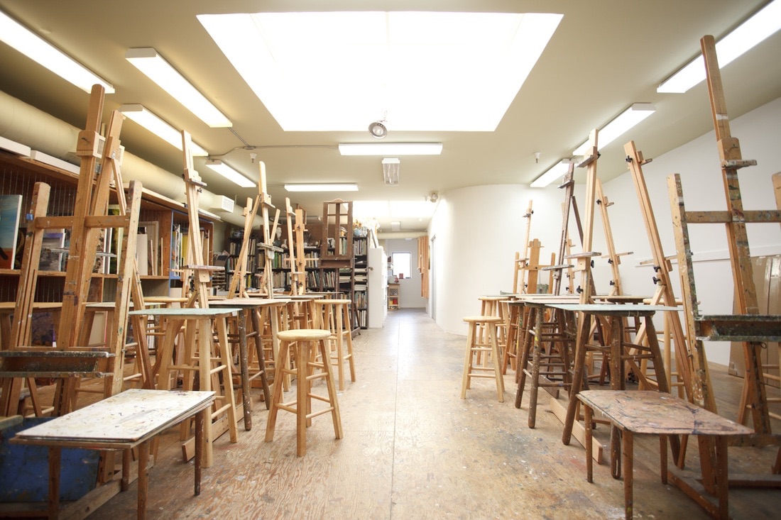
A lot has changed in the cultural sector over the last 20 years. The NEA cut funding for individual artists,[1] more people are graduating with art degrees than ever before,[2] and the implicit value of art is increasingly defined by skyrocketing market prices, which only reward a minute percentage of artists.[3] Sometimes it seems as if the only thing that hasn’t changed is art schools themselves—at least in terms of their curriculums. In order to succeed in this highly competitive environment, visual artists need arts entrepreneurship training that post-secondary schools often fail to provide.

​In the contemporary creative sector, the majority of artists’ careers are entrepreneurial.  A survey conducted by the Strategic National Arts Alumni Project (SNAAP) confirmed that the majority arts graduates who find work in their field utilize an entrepreneurial skill set: out of the 92,113 artist alumni polled, over 60% were self-employed, and 14% founded their own company.[4] Creative industries scholar Ruth Bridgstock defines arts entrepreneurship as 1) creating a new venture, 2) the description of an enterprising individual, or 3) a means of employment and career self-management.[5] Most importantly, arts entrepreneurship draws upon distinct skill sets that are not taught in traditional business contexts. 

​Yet this entrepreneurial approach is not reflected in the majority of fine arts programs’ curricula. Bridgstock writes, “relatively few tertiary arts schools attempt to develop capabilities for venture creation and management (and entrepreneurship more broadly) and still fewer do so effectively.”[6] Instead, most BFA and MFA visual arts programs focus almost exclusively on studio classes, neglecting to incorporate the managerial skills their students will require post-graduation. USA Today author Dan Berrett explains, “If arts graduates exhibited a tendency toward resourcefulness and entrepreneurship, it was not because of help from their institutions.”[7] In the latest SNAAP survey, over half of the respondents indicated they were dissatisfied with the career preparation provided by their alma maters.[8]

One might argue that we do not know where successful artists obtained their entrepreneurial skill set. If many artists are creating successful careers, perhaps they learned their business skills indirectly through their studio practice, or simply don’t need formal training at all. Yet a survey conducted by BFAMFAPHD found that arts graduates were actually less likely to make a living off their work than non-arts graduates.[9] Moreover, many arts graduates ultimately decided to abandon their career path because they could not find work.[10] Clearly, art schools could do a better job preparing their students for arts careers.
Many educators and administrators acknowledge their institutions’ short-comings: "It's clear that we need to be doing a better job of preparing our students for the business realities that they face after graduation," writes Douglass Dempster, dean of the College of Fine Arts at the University of Texas at Austin.[11]

If art schools recognize the problem, what are the barriers to change? First, many faculty are not in favor of teaching professional practices.[12] Like many students and artists, they see arts entrepreneurship as a subsidiary vocational practice and object to it on pedagogical grounds.[13] Even if faculty accept the ideology in principle, they may not be able to provide instruction in practice: since they didn’t have access to professional practices while they were in school[14], they may not have the skills necessary to teach students.

Second, professors who are willing and able to teach professional practices face an additional barrier: namely, the sheer amount of coursework required to attain an art degree. "Most of the professional fine arts degrees are saturated with regimented requirements that leave little room for additions," writes Dempster.[15] This was certainly the case for my alma mater, UNC Asheville. In addition to extensive liberal arts requirements, BFA studio art majors were required to take an intensive 68 hours of credits towards their major—enough hours to earn both a political science and economics degree at the same university. While the program recently reduced curricular requirements, it did not do so without major resistance. The department still does not offer any coursework  
Finally, like most arts institutions, tertiary art programs are operating under very limited resources. Only so much can be accomplished within one degree program. With faculty and staff already over-extended, it’s easy to write off extra coursework, especially coursework traditionally associated with other areas of study (i.e. business or marketing). Yet, as Bridgstock points out, arts entrepreneurship and business entrepreneurship are not the same thing.

Yet I believe there’s room for both studio art and arts entrepreneurship in art schools’ curriculums. Since it’s not possible for any degree-granting program to be comprehensive, replacing a few studio art courses with professional practices would represent a better use of limited resources. This way, the curriculum focuses on teaching essential skill sets. Studio art classes teach problem solving, creative autonomy, and methods of visual evaluation; arts entrepreneurship teaches the state of the creative sector and students’ conceivable roles within it.

Professional practices training does not always require additional classes. Much of the coursework could be integrated into existing classes. Supplementing studio work with writing assignments, for instance, fosters written communication skills. Extracurricular projects and student-led organizations can also supplement the curriculum. Mentoring students throughout a grant application process, or modeling the gallery application process would be highly beneficial for an aspiring artist. This type of instruction is not only educational, but also essential in a field that necessitates entrepreneurship. In response to the contemporary creative sector, tertiary arts programs must adapt to their students’ needs by challenging the traditional fine arts curriculum.


[1] Diana, Schemo, “Endowment Ends Program Helping Individual Artists,” The New York Times, 1994, http://www.nytimes.com/1994/11/03/arts/endowment-ends-program-helping-individual-artists.html.

[2] Susan Jahoda, Blair Murphy Murphy, and Caroline Woolard, screenwriters, Artists Report Back, BFA MFA PHD, 2014.

[3] Andrea Fraser, “L’1%, c’est moi,” Artforum, 2011.

[4] Dan, Berrett, “Arts graduates find jobs, satisfaction,” USA Today, 2011, http://usatoday30.usatoday.com/news/education/2011-05-03-inside-higher-ed-arts-programs-college_n.htm.

[5] Ruth Bridgstock, "Not a dirty word: Arts entrepreneurship and higher education," Arts & Humanities in Higher Education 12, nos. 2-3 (2012).

[6] Bridgstock, "Not a dirty word," 122.

[7] Dan Berrett, “Arts graduates find jobs, satisfaction.”

[8] Strategic National Arts Alumni Project: Tracking the Lives and Careers of Arts Graduates, SNAAP, http://snaap.indiana.edu.

[9] Susan Jahoda, Blair Murphy Murphy, and Caroline Woolard, screenwriters, Artists Report Back.

[10] Dan Berrett, “Arts graduates find jobs, satisfaction.”

[11] Dan Berrett, “Arts graduates find jobs, satisfaction.”

[12] Barry Hessenius, "Interview with Ruby Lerner," Barry's Blog. Last modified March 2, 2014. http://blog.westaf.org/2014/03/interview-with-ruby-lerner.html.

[13] Bridgstock, "Not a dirty word," 128.

[14] Barry Hessenius, "Interview with Ruby Lerner."

[15] Dan Berrett, “Arts graduates find jobs, satisfaction.” 
0 Comments

Process Study: Blue Staircases (Clay)

11/1/2015

1 Comment


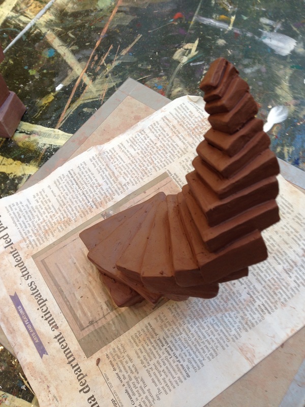
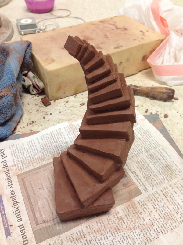
Realizing the Clay Forms

Picture
Picture
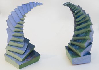
I wanted the stairs to look as if they defied physics, to be impossible to climb. Creating precise edges in clay was really difficult. I also had to make the staircases look physically impossible without actually falling over.
From a technical standpoint, this made the bottom two steps essential: they had to be heavy enough to support the titling form.  

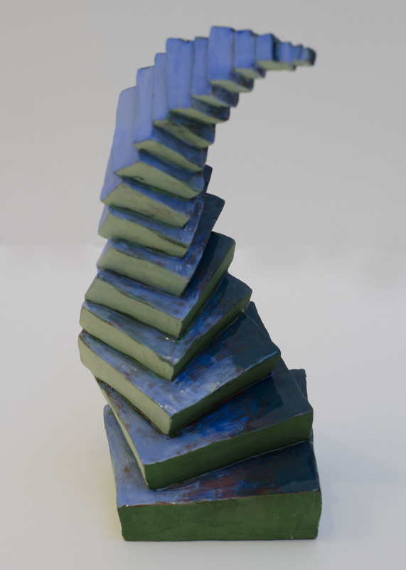
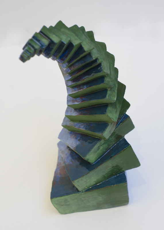
Glazed Objects

Picture
Picture
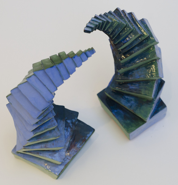
I glazed (the ceramic version of paint) the forms to highlight the juxtaposition between matte and gloss. 
As a painter, I attempted to create gradients with the glaze like one can with acrylic or oil, so it appears that one color is fading into another. 

Displayed Together

Picture
Ultimately, I decided to display the two sculptures together. I liked the tension they created by almost touching, but not quite. After all, it worked for that little known painting The Creation of Adam. 
Picture
1 Comment

Process Study: Waterscape

10/25/2015

0 Comments


1. Design the form

Picture
Picture
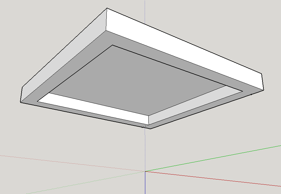
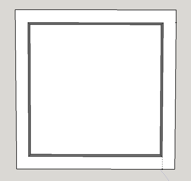
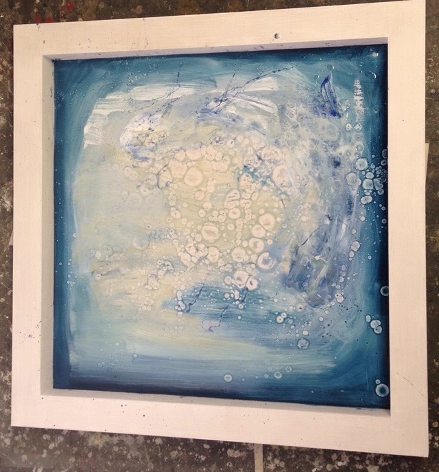
As with many of my paintings from the Perpetual Pursuit series, I began this panel by designing it virtually. I initially planned on hanging the piece fro the ceiling (as shown in the left image), but ultimately determined 1) this was too much of a direct reference to James Turrell's "Skyspace" series, and 2) that this posed an major lighting dilemma. I wanted the piece to be well-lit, an impossible task for a piece hung with its back literally to the light. I thought about displaying the piece on the floor, too, as it was intended to abstractly emulate water.  

I liked the idea of framing an abstract place where you would rather be.

2. Begin painting

Picture
I did a lot of the painting on the floor. The bubble-like forms are composed from flicking water into the oil paint. Since oil isn't water soluble, the water marks end up removing the pigment--leaving residual droplets behind.

3. Finalize painting

Picture
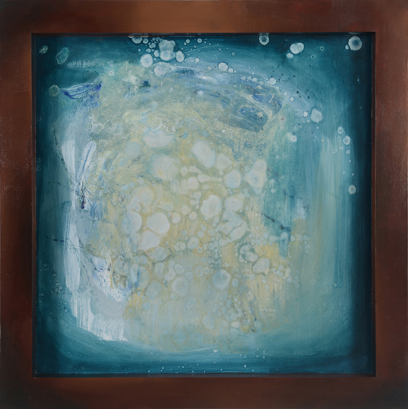
On the inner portion, I wanted to refine the piece while still leaving evidence of the water-like bubbles. It took me a long time to find a color that wasn't too dark, but wasn't too light to accomplish this. On the outside portion, I wanted to create a gradient in a color that complimented the inner panel. I spent hours wet-on-wet blending to make the transitions look smooth. While not pictured here, the sides are painted as well.

4. Display

Picture
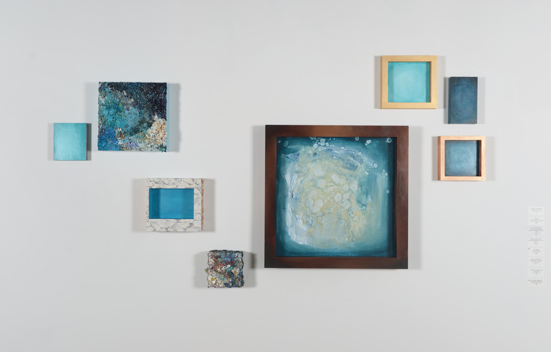
Ultimately, I ended up hanging "Waterscape" on the wall amongst a constellation of other pieces. Together, they formed an installation. The piece is now among the private collection of UNC Asheville's provost. More and photos of "Waterscape" can be found here. 
0 Comments

Process Study: Topography

10/17/2015

2 Comments


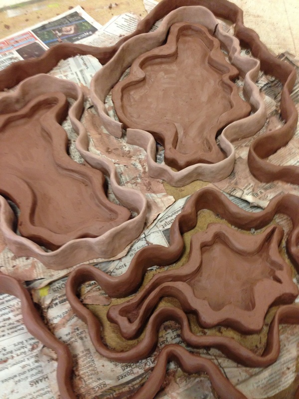
Creating the Clay Forms

Picture
Picture
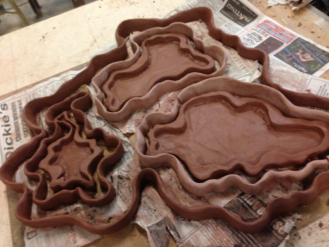
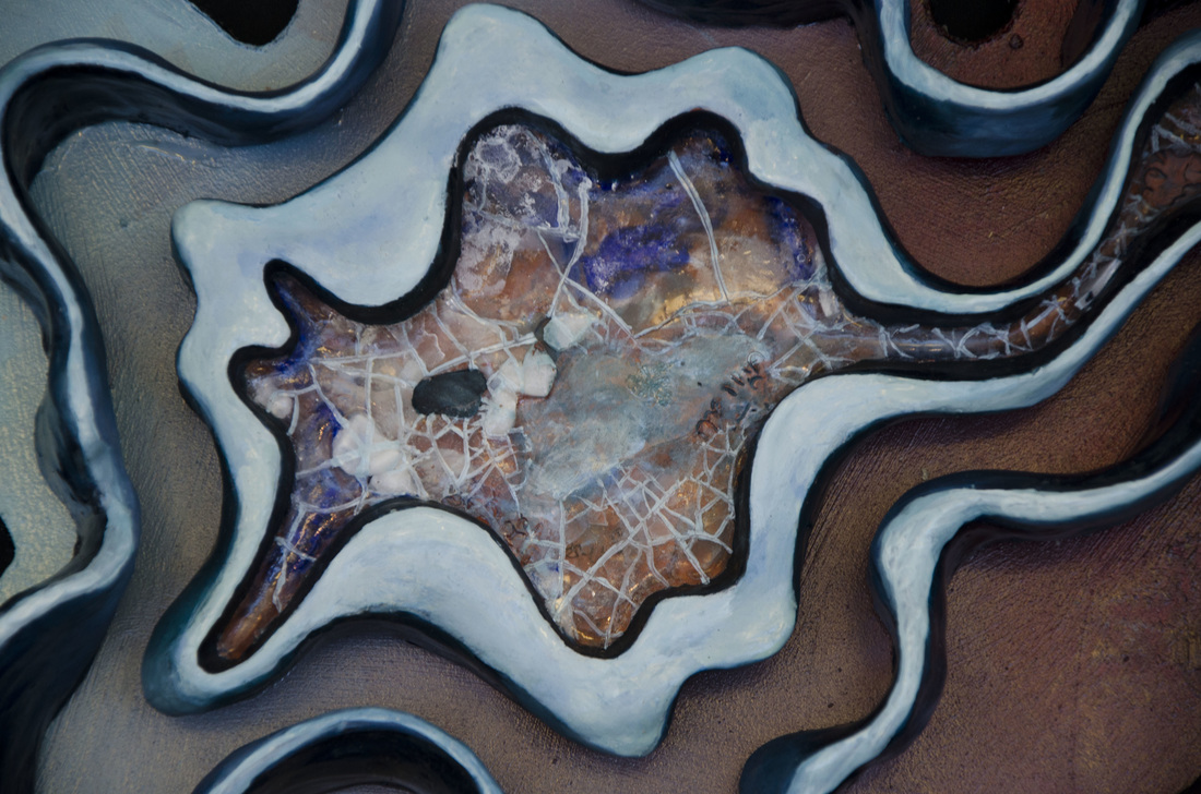
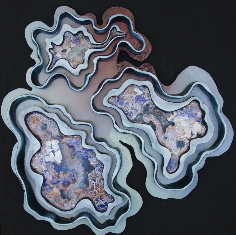
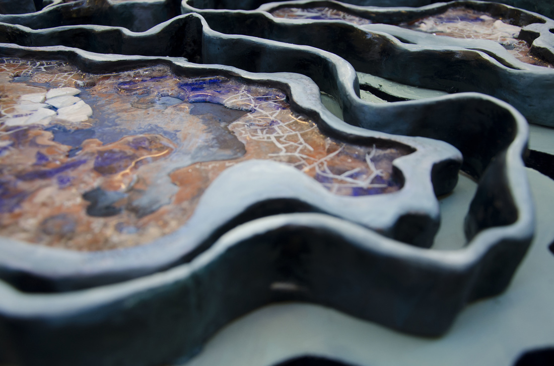
Originally realized in clay, these forms were designed to resemble topographical maps. They "fit" together like puzzles, creating an organic assemblage of pieces.

They "fit" together like puzzles, creating an organic assemblage of pieces. 
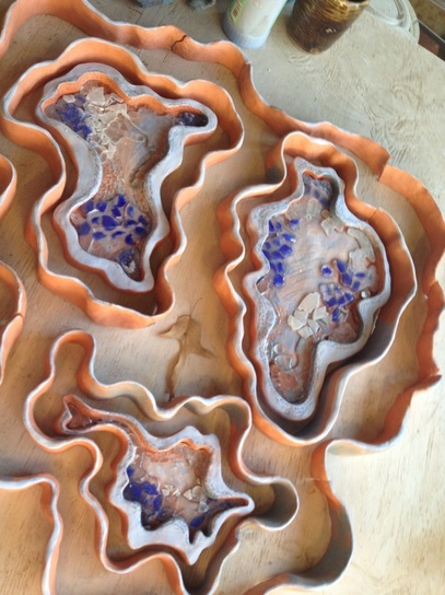
This is the piece after it came out of the kiln--the first time. I did some minimal glazing, and the glass didn't melt as much as I wanted it to. Moreover, the very outer ring cracked! I was going to redo it, but my ceramics teacher convinced me that it was for the better, that the form was too complicated anyway. In the end, the MDF board ended up functioning at the outer ring.
Picture

Cutting & Painting MDF Board

Picture
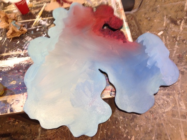
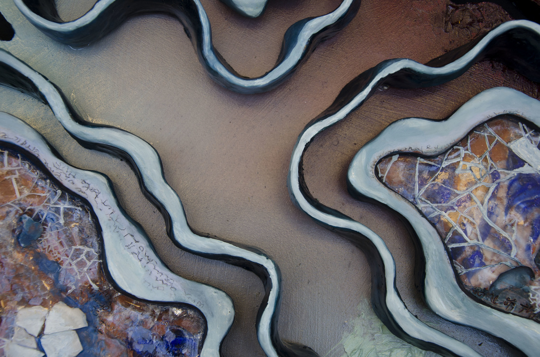
After cutting an MDF board to size (the curvilinear shapes were a bit tricky on the band saw), I began painting the panel. I wanted the panel to support rather than distract from the main ceramic piece, so I stuck to relatively simply blending with a few accents. I particularly liked drawing attention to the very edge of the board, so I painted it a deep, contrasting blue.

Painting the Fired Object

Picture
Picture
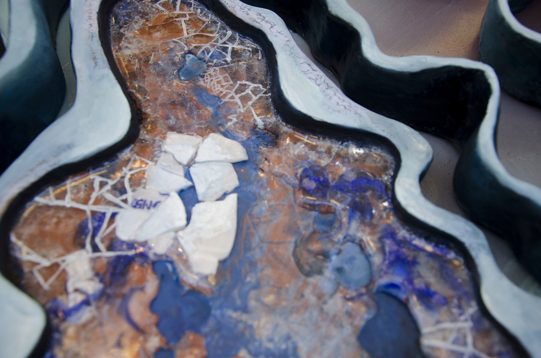
After the second firing, the glass melted more. I painted over the clay in oil paint, and painted over the glass in spiderweb-like patterns. You can also see text written faintly in the lefthand image.

The Final Piece

Picture
Picture
Picture
2 Comments

10 Things to Never Say to a Visual Artist

7/21/2015

1 Comment

 
I've put together a list of common misconceptions, as well as frustrating, rude, or ignorant comments people often make when you tell them you're an artist.

1. "Why do you make art?"

Picture
To keep me out of trouble? Because robbing banks seemed less fun? Sometimes I think the quickest way to tell whether or not your comment is appropriate is to try it with another profession. I've nicknamed this the Doctor-Lawyer-Indian Chief Test, or DLI Test. In other words, would it be appropriate to ask a doctor why they practice? Not really. You could ask them how they got into medicine. But you wouldn't put them on the spot to justify their entire career path in an elevator pitch. 

2. What's your inspiration? 

Picture
When people ask me this I'm really tempted to just say, "Living? Breathing? Being human?" As Chuck Close said, "Inspiration is for amateurs. The rest of us just show up and get to work." While I'm sure there are some exceptions, I really believe the notion of inspiration is a common misnomer. I for one am not moved to go to the studio any more than a real estate agent is moved to sell houses, or a stock broker to analyze the market. Sure, once I get there, I make discoveries and successes and failures and rewards like the rest of us. But the notion that an otherworldly light parts from the heavens moving me to set paint brush to canvas is largely false. 

The trend here seems to be that art making is not all that different from other professions, yet it is somehow regarded as both reverential and inferior. All the useless aggrandizement with none of the day-to-day benefits.

3. "Remember me when you're famous!"

Picture
Quick: name three living, breathing artists who are actually a household name. You have 10 seconds.  

Unless you're a art connoisseur or happen to run a high-profile museum, you probably came up with nothing. So let us not raise our hopes up unnecessarily (I tried this with my dad, who came up with "Andy Warhol." Yeah, he died in '87).

4. "You're so talented!"

Picture
This one may seem a bit counterintuitive, but bear with me. Sometimes people chock up artistic success to talent, which kind of implies there's no work involved. And that's frustrating, because art is a skill like any other: it takes countless hours to learn how to draw, paint, throw on the wheel, etc. Artists don't wake up one day with the intuitive knowledge of chiaroscuro or wet-on-wet blending. It takes practice. While, sure, some people are more visually inclined than others, the idea that it just happens naturally--something innate, something you are born with--is a myth. 

This idea of the artistic genius dates back to the male renaissance complex associated with giants like da Vinci, Raphael, Michelangelo, etc. Like it or not, those voices disporportionaley shaped Western art history. And like it or not, every time the word "talent" is employed in this context, it reinforces a narrow scope (i.e. male, western, neoclassical) of aesthetics, reasserting a limited conception of who and what qualifies as valuable art and art makers. 

5. "I could never do what you do." 

Picture
Actually, you probably could. If you can hold a pencil and have the patience to spend countless hours learning how to draw, then yeah, you could make stuff as well. But not everybody wants to put in the time, money, effort, and honestly--little recognition--it takes to make things. And that's understandable.

6. "I have all this empty space in my apartment/ school/ restaurant /business if you want to put up some of your paintings!"

Picture
Would you expect a doctor to examine you for free? An accountant to do your taxes because it's fun for them? How about getting a massage, throwing your clothes on, and then unabashedly walking out the front door? No, because they provided a service and deserve to compensated for that service. Or, if you are not interested in employing their expertise, that's fine--but don't ask them to provide it for free.

W
hat's even worse about this statement is that people actually expect you to be excited. Believe it or not, I am not falling over myself at the prospect of turning over my hard work and supplies for nothing. And no, it's not free marketing.

7. "So... have you been, like, eating ramen for like a month?" 

Picture
Back to the DLI test: it's never okay to ask someone how much money they are making. Even if the profession notoriously doesn't pay well. You wouldn't ask a nonprofit consultant if they are having a hard time making rent, because, well, it's none of your business. From the same logic, it's not okay to ask an artist if they are starving. It's disrespectful and further reasserts the idea that their work is not valuable.

8. "Will you draw a picture of my dog?"

Picture
Fine art is about as far from a portrait of someone's dog as Bush is from a democrat. It's not fun for a painter to make a painting of your dog. It's kind of insulting and also kind of a sell out. Speaking of which...

9. I need something green for my house (to match my living room)! Do you do commissions? 

Picture
If you are interested in our work, we have a portfolio. You know, work we already put a ton of time and money into. Look at the portfolio to see if you even like the kind of work we do before you start treating us like pottery barn. And if you are interested, it would be better (and more respectful to the artist) to purchase something from there. If not, there's a pottery barn down the road...

10. "What does it mean?"

Picture
Try again.  A better question might be, "What concepts inform your work?", "Who are your artistic influences?", or "What kind of visual vocabulary do you use to get at your idea?" 

We appreciate the interest, we do. And most artists enjoy talking about their work. But try to use appropriate language when asking an artist about their art, because something like "What does it mean?" feels like we have to justify ourselves and our work on the spot.  Art is valuable, and artist shouldn't have to spend every cocktail hour and elevator ride trying to convince people that what they do matters. 
1 Comment

Process Study: The Farther 

7/12/2015

1 Comment


1. Design Form

First, I created a sketch of the form I wanted to create. This sketch does nothing for informing the painting process, but instead outlines the form I'm going to create in a strictly sculptural sense (pardon the lack of photo; all my sketchbooks are in a cardboard box somewhere in preparation for the move to NYC). 

2. Realize Form

Picture
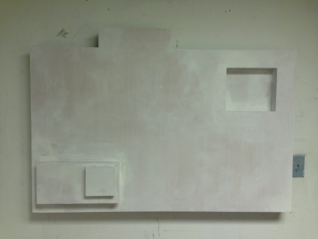
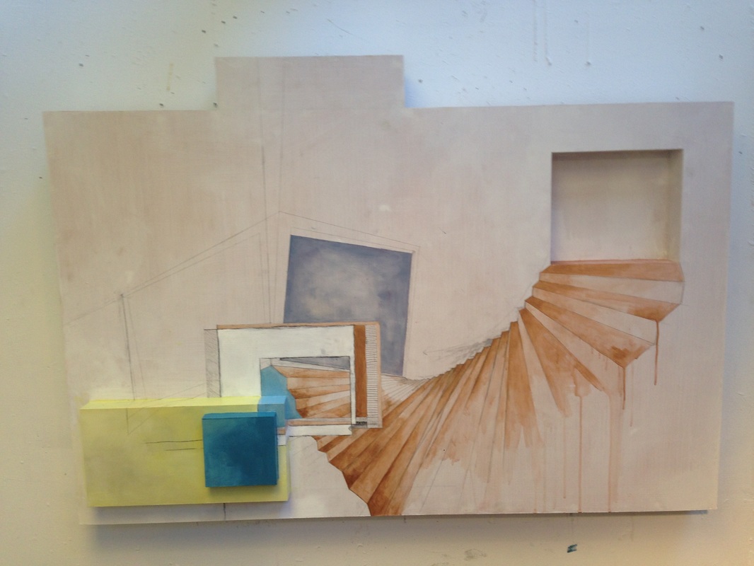
Here is the panel all gessoed and ready to be painted in my studio. The rectangular elements you see both recede (top right) and come forward (bottom left) into space. 

3. Begin the Painting Process

Honestly, this piece went smoothly from the beginning. Note that this is NOT always the case. Making a series of art pieces is kind of like having multiple children: some of them seem to obey from the get go, while others are a bit of a struggle. And then you have to find them homes where they will be safe and stop bothering you, but that's a whole other blog entry... 
Picture
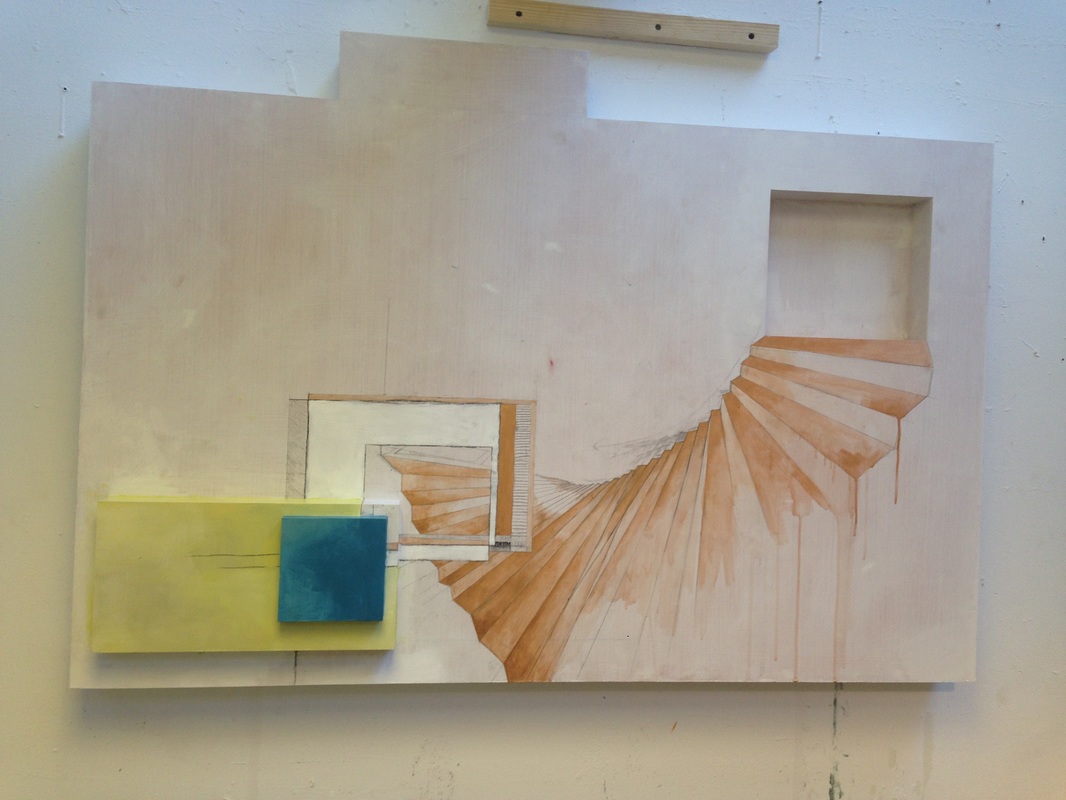
The beginnings of the painting process. I found starting this painting really easy in terms of figuring out the composition, as it already had a preprogrammed composition in the form of 3-dimensional space. As per usual, it felt like there needed to be a ephemeral staircase leading up to the top righthand corner. I actually painted the part in acrylic instead of oil (metallic colors don't really exist in oil). It's important to do any acrylic layers before oil, as things tend to disintegrate if you do the reverse. 
Picture
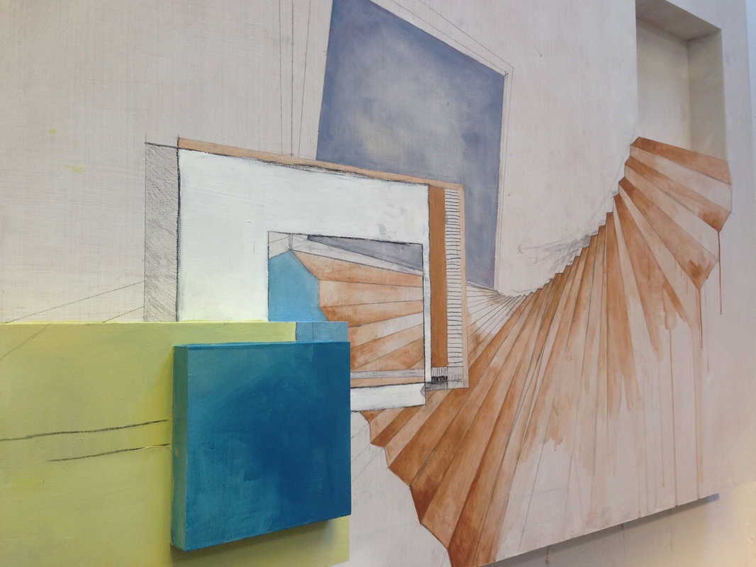
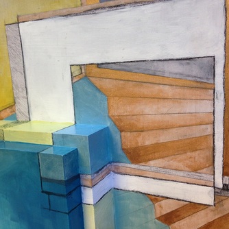
Here's a side view. I enjoyed the connections between the real and illusionistic frames--especially the white rectilinear form framing a miniature composition within a composition. The lines to the right, right before the bronze staircase, are actually retraced with hot glue so that they have a textural, tactile component (not that you're allowed to touch) in person.
Picture
I know this piece seems like a bit of jump, but I think it's because this phase fell into place quite quickly and easily. Here I've added a molding paste and graphite texture to the white rectangle, done a layer of phthalo  blue over the previously purple portal, and painted the shadowbox in the upper righthand corner a sky blue (as obviously the destination of the staircase has to be a bluespace. For more on bluespace, see my artist statement). I also added used tape in a mostly vertical fashion, cutting the bottom edge with an exact knife so it perfectly matches the negative shape of the receding staircase. 
Picture
In addition to the purple portal, you can see the faint graphite lines outlining the next phase of the composition. I liked having an in-perspective frame to juxtapose the straight-on view of the white rectilinear element. I was already really excited about this painting at this point.
Picture
And a detail shot. I really liked how this particular area was coming along--especially that the 3D aspects mimicked a staircase. Made for a nice connection between the literal and the illusory. 
Picture
At this point I knew it was time to slow down and stop adding too many elements to prevent it from getting busy. Nonetheless, the top lefthand corner felt empty. It definitely needed something--albeit something subtle. 

Here I also added a strip of gold and bronze palette scrapings, or recycled paint. You can see it very faintly in this photo to the right of the molding paste. 


Picture
So I added paint drips to the blank-ish area, which I felt resolved the issue. And I almost left it this way. In fact, I was so sure it was finished, I had my good friend Amryn Soldier photograph the piece. What changed things was what often changes things: my advisor, Virginia Derryberry. Virginia engaged me in a conversation that made me think about other possibilities. She got me thinking about pieces: pieces of compositions, pieces of rectangles, pieces of artistic waste in comparison to the whole. 

And that’s when it occurred to me: The Farther was practically asking to have smaller pieces added to it. It would be the perfect solution to its pseudo-rectilinear problem—that is, how its barely not a rectangle. As art school will tell you, if you’re going to do something, do it all the way. Either make a perfect rectangle, or make it damn clear you weren’t trying to. Assert your piece in all its non-rectilinear glory. 

4. Reevaluate 

Picture
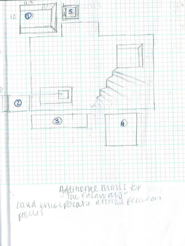
So I turned to my sketchbook. I ultimately decided to add 5 small pieces--separate panels, but displayed as part of the piece. I determined their general shape and placement while looking at the existing piece. 

I wanted each  additional panel to complement both the sculptural and painted elements of the existing piece. In other words, they needed to make visual sense from a 2-D and 3-D perspective. 

4. The Final Product

Picture
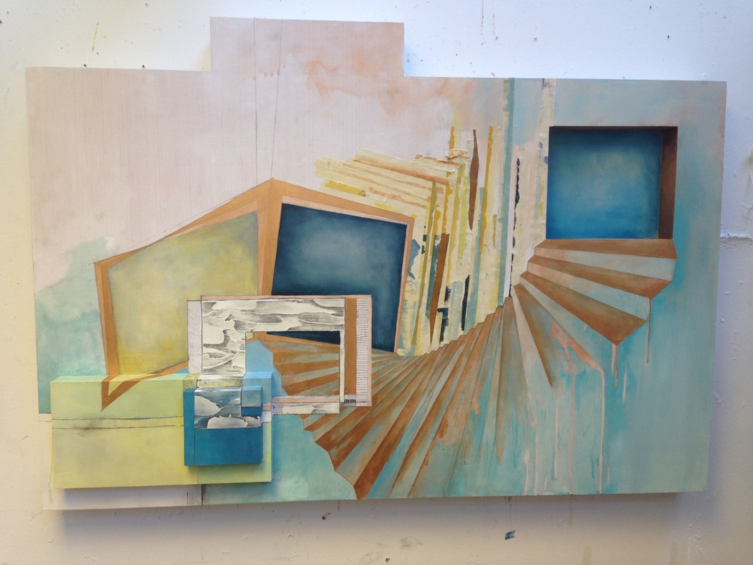
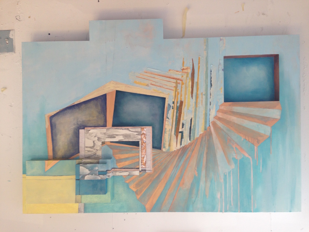
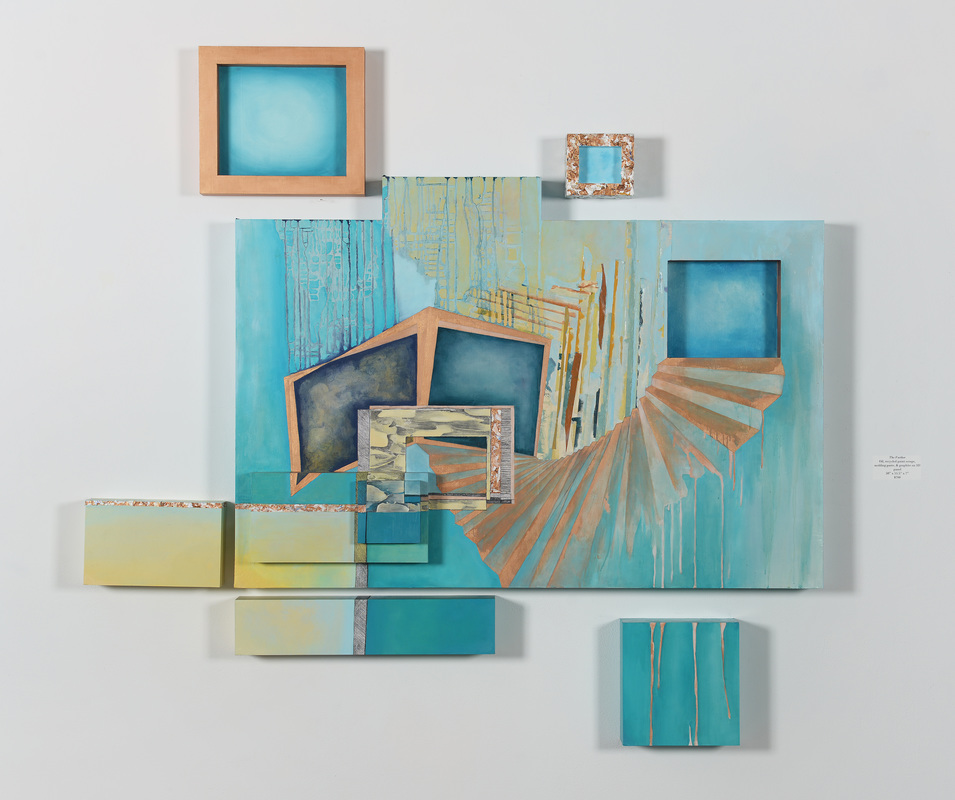
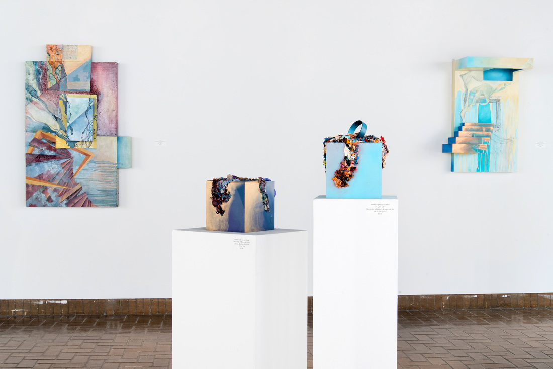
Here hangs the final product in my solo show, Perpetual Pursuit: Painting the Unattainable, in Tucker Cooke Gallery! The top two pieces are actually 3-dimensional, imitating a frame where the outside comes forward into space. This goes conceptually along with the idea of trying to reach a space or idea that remains physically above, out of reach. Their measurements were designed to "tuck" into the rectilinear silhouette the larger panel creates. 

The other three pieces continue the composition of the painting, extending golden palette scrapings to the left, the thick graphite line downwards, or continuing the bronze drips against a aquamarine backdrop. 

(Bonus points if you noticed that piece #5 ended up moving to the right and down some so it fit in the corner.)

The final product was hung slightly above eye level as to reassure the themes of ascension throughout the show.

See the full features of The Farther here, or the rest of the solo exhibition images here. 


1 Comment

Process Study: Land of the Above

6/30/2015

0 Comments

 
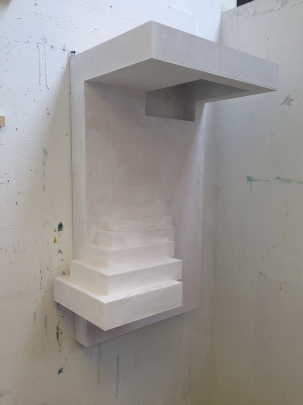
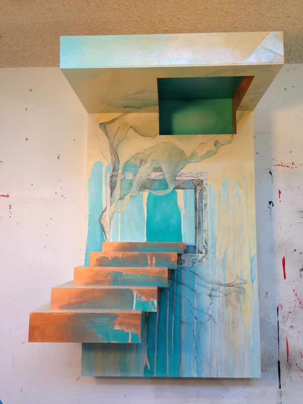
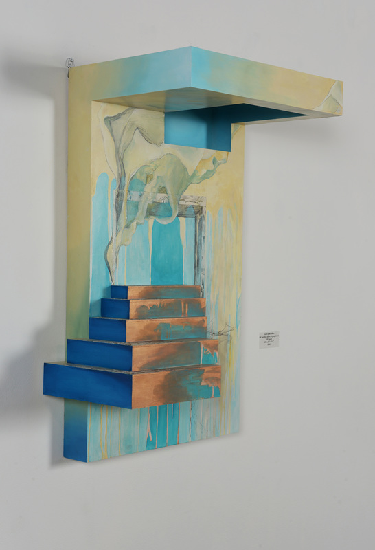
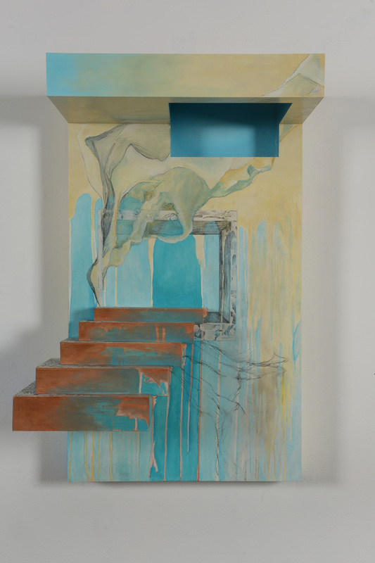
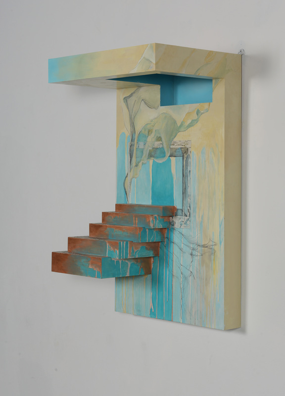
This process study focuses on another cornerstone piece of my BFA portfolio, Perpetual Pursuit: Painting the Unattainable, Land of the Above. The piece is for sale for $700; see the full product detail here. 

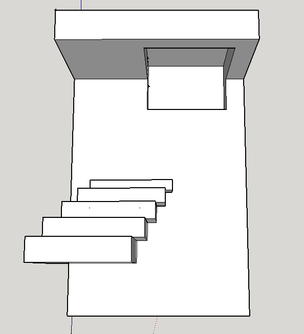
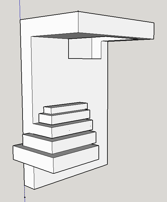
Land of the Above began with a suggestion from critique. Professors and peers were pushing me to jump more wholeheartedly into the realm of 3D. In short, if you're going to do it, do it right. They said that some of my other pieces felt tentative, and it would be nice to have something more deliberately and obviously in the realm of the third dimension. Here is the process that ensued... 
Picture
Picture

1. Make a Model

When I made this design in Sketchup, a 3D modeling software, I barely knew how to use the program. I had taken an architecture class in high school I admittedly payed little attention to, and my Sketchup skills were limited to my shoddy performance over 3 years prior. But I was dead-set on using it, as drawing the form wouldn't really allow me to change my mind and re-evaluate the composition the way I wanted. Sketchup would be much easier... that is, if you know how to use it. Making this admittedly basic form (compared to what Sketchup can do) took hours of frustration and mumbling foul language at the computer. After I finished what you see here, I used proportions to attach numbers to each plane, which ended up being down to fractions of an inch. 

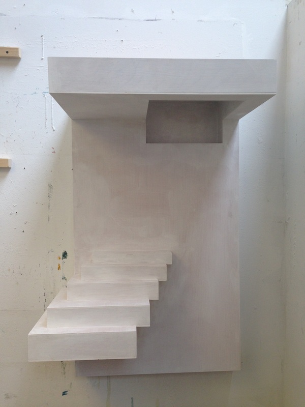
2. Realize the Form

Picture
Picture
This is what the form looked like, gessoed but unpainted. It barely fit in my studio, and I had to hang it specially. In order to paint the overhead shadowbox, I had to stand on a chair and turn my head awkwardly skyward, Michelangelo-style. 

3. Begin the Painting Process

Picture
Picture
I distinctly remember this painting process being a difficult one. Part it could have been that it was crunch time in the semester, but it was more than just that: this was the first "painting" I'd done that, even its its blank-panel stage, already had a composition-- a 3 dimensional one.  Even thought the panel didn't have any paint on it, it wasn't really blank. With largely 2 dimensional works, the painting part can speak for itself. After all, that is the main element. But with this piece, I had a hard time not overdoing the painting. I had a hard time stopping. My studio mate and sanity-keeper Louise Thompson begged to me leave the graphite sketches of a curtain-like form you can see to the right of the staircase untreated. I wasn't convinced, but I ended up leaving the painting be. For weeks. Maybe even a  month, which I basically never do. But I was stuck. 

And to make matters worse, I had another, more complicated problem: lighting. The shadowbox, "cutout" form in the upper right hand of the panel looks green, right? Only I had painted it blue. It needed to be blue, as this color is essential to my concept. I wanted the viewer to WANT to access this unreachable (both literally and figuratively) bluespace. Which, frankly, doesn't work if it's green. And it's hard to make something appear to be bright when it's quite literally in shadow. And how are you going to  light that plane in the gallery?, everyone asked. I had no idea.

4. Problem Solving

Picture
Picture
Picture

5. Display

Two crucial things happened in this phase:
  1. I had to deal with the overhead shadowbox situation. Many ideas were suggested, most of which freaked me out. The scariest involved cutting out the overhead shadowbox altogether (it's made of wood, so this would involve some pretty powerful and precise power tools I did not feel comfortable operating) and replacing it with a sheet of vellum, behind which I could shine a light. Instead, I went with a brilliant suggestion from a classmate, Jen O'Connell. Jen said, "why don't you just paint the shadowbox to look bright?" In other words, overcompensate for the cast shadow by painting the area so bright it ended up looking the way I wanted it to. This is what I ended up doing. If you looked at my palette at the very color I used to paint the overhead shadowbox, it actually looked very different than what you see in the painting. Optical illusions, man. 
  2. As you can see on the leftmost photograph, I added a deep cerulean blue to emphasize the left edge of the staircase and diversify the color palette. 
Picture
Finally, in the gallery, I hung the piece way above eye level, so the viewer had to look up and into the bluespace. This decision spoke to the work's conceptual ties with ascension, one of the few constants that remained unchanged in the execution of the piece. 
0 Comments

Process Study: Staircase in Blue

6/24/2015

0 Comments

 
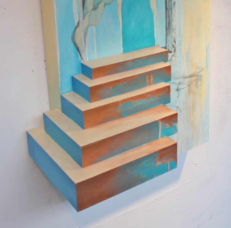
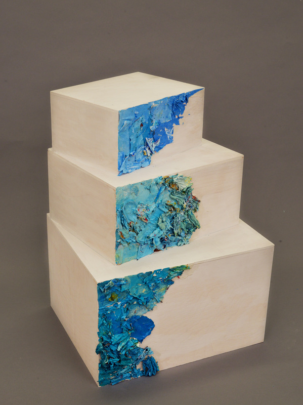
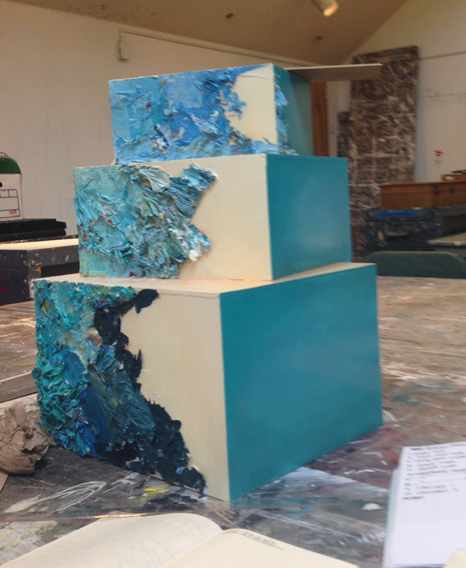
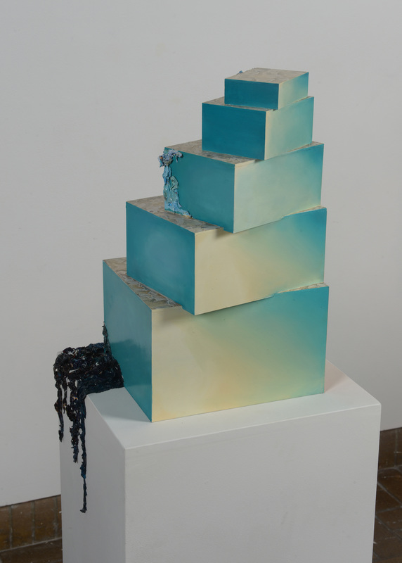
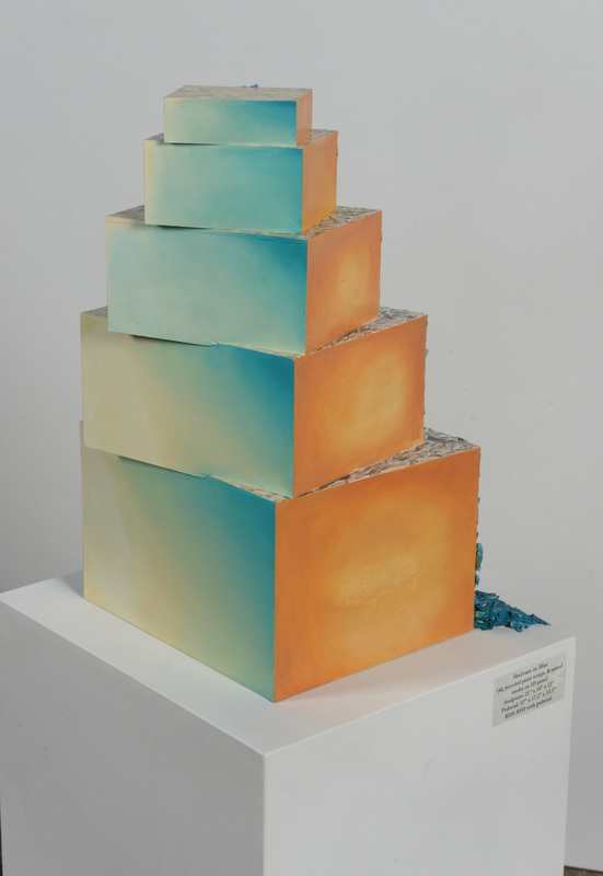
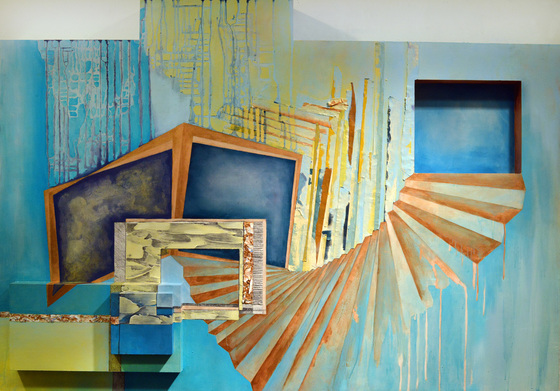
I've been wanting to do a "process study" series for awhile now: that is, to create a visual narrative to demonstrate how decisions are made in the studio. For this entry, I'll focus on "Staircase in Blue," one of my first 3-dimensional staircases. While it is displayed on a pedestal, earning it the official title of a sculpture, the piece is essentially comprised of five thick, stacked panels. So you could almost think of it as five miniature paintings, arranged to take on the form of a staircase. Like many of my works in the Perpetual Pursuit series, this element allowed the object to walk the line between painting and sculpture.

Here is a step-by-step process of how this piece came to fruition (at least as much as we can reduce the whole fine art endeavor to linear steps):

1. Make a Drawing

Picture

2. Create the Form

Picture

3. Realize

Picture
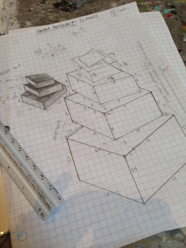
First, I'll make a drawing. Which unfortunately does involve math. I plotted out how I wanted the forms to look,  and then used a scale to attach numbers to the forms. I like to make the shapes first so I have an idea of how I want things to look proportionally before I dive into numbers land. For this piece, I initially thought I would make three blocks, or "steps," though I later later this approach didn't look visually enough like a staircase.  The evolution of this decision making can be seen in the sketch on the right. 

This is what the form looked like when it was actually made. Constructed out of plywood, I was able to arrange  the stacked rectangles to give each "step" the appearance of twisting, like a winding staircase. The texture on the surface consists of repurposed studio materials, or what I like to call "artistic waste." This material in particular falls under the category of palette scrapings, which is what I call recycled paint that has been scraped from a painter's palette and reattached to another surface. In the studio, I save used paint and categorize them by color and texture. Similar hues of blue are grouped together on each step to create a gradient. Finally, I like to concentrate the majority of the texture on the side that appears to be rotating, drawing the viewer's attention to this edge. When the form is painted later, I will further emphasize this area.

4. Reassess

Picture
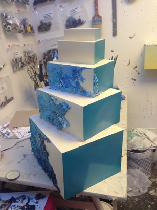
After painting the form on the left, I still wasn't quite happy with it. It appeared stumpy--almost squat--and after asking a few classmates' opinions, we agreed it needed a couple more steps. I thought this adjustment would 1) make the piece more aesthetically pleasing and 2) create a form that looks more like a staircase. After figuring out the dimensions of two more blocks, I attached them to the form to create the image on the right. The white texture faintly evident on the horizontal plane is molding paste, which I often use to create texture in my work. In the next step, you will see this element with more contrast, as I ultimately draw over the medium with graphite pencils. This takes hours, and can be quite meditative (I usually break out the This American Life podcasts for this step). 

5. Finalizing & Display

Picture
Picture
Picture
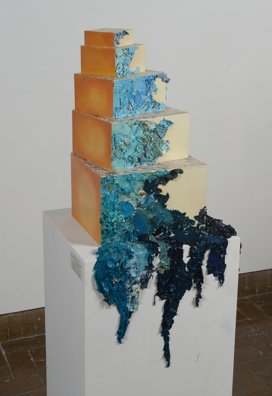
From left to right, this is what the final piece looks like in the round (i.e. walking around the piece in the gallery). 
Several things happened to get to this stage: 
  1. I finished painting the form. The ochre (orange-looking) color alongside the artistic waste was chosen to emphasize that edge, as orange is blue's complementary color. 
  2. I had a pedestal custom made to suit the piece. I wanted it to not only be the right height (so the object would be eye-level with most viewers), but also the right width as to appear to be the next "step" should the staircase continue downward. 
  3. Continue the artistic waste onto the pedestal: the main reason I wanted to have my own pedestal (as opposed to borrowing one from UNC Asheville's art department) was so I could have the artistic waste/ palette scraping texture drip down from the piece. I wanted this to be part of the sculpture's display, and galleries don't tend to like it if you mess with their pedestals. I think the idea stemmed from critique, and I loved the prospect of drawing more attention to the artistic waste element. To match the color perfectly, I ended up "manufacturing" artistic waste; in other words, I mixed up the exact color in oil paint, let it dry (this takes a few days), then scraped it up and reapplied it to the pedestal. Ultimately, I think this visual decision really adds to the piece. 

6. Recognition

Staircase in Blue ended up placing first in Art Front's 48th Annual Juried Exhibition! The work is for sale for $350 (pedestal included). See the full product detail here. 
0 Comments

Barriers to Arts Participation: On Perception, Value, and Luxury

8/26/2014

0 Comments

 
Originally published by Americans for the Arts on ARTSBlog
In America, the arts are often seen as a luxury. They are the first thing to go when school boards cut budgets, and successful arts policy is seen as the exception, not the rule.

Like other so-called “luxuries,” people go to extreme measures to preserve its integrity. Historically, art is something we risk incarceration for, accept poverty for, or in the case of the quintessential rock star—quit your job, sell your house, and move across the country. Chuck Close said art saved his life. Ai WeiWei has been detained by the Chinese government. Thrice. Clearly, we’re onto a powerful motivating force.
Read More
0 Comments

LAAs, FAQs, and Other Acronyms: Reflections from a  Summer Intern

8/24/2014

0 Comments


Originally published by Americans for the Arts on ARTSBlog


Ask a fine arts professional about arts management and most will respond with something along the lines of, “What is that?” At least that was my experience when I inquired about the field at my small liberal arts school in Asheville, North Carolina. Such reactions lead me to believe I was entering the uncharted territory of a highly specialized, obscure field. This is not the case.

Picture
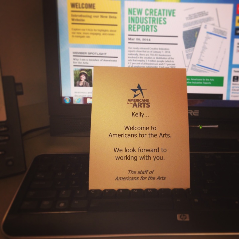
My Welcome Card
Over the summer, I spent two and half months interning at a national nonprofit organization, Americans for the Arts. A complicated and multifaceted organization, Americans for the Arts’ main objectives can be oversimplified into two main functions: 1) assist local arts agencies across the nation with the tools and resources they need to succeed, and 2) advocate for the intrinsic, educational, and economic value of the arts with respect to national and local policy.

Americans for the Arts hosted eight other summer interns: two in New York City, and seven in DC. We each represented one of AFTA’s respective departments; I served as their Local Arts Advancement Intern. 


Read More
0 Comments
    Picture

    Author

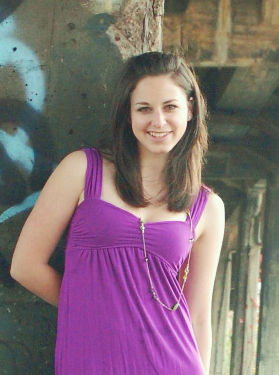
    A NYC-based visual artist and arts administrator, Kelly holds an MA in Arts Administration from Columbia University and a BFA from UNC Asheville, where graduated Valedictorian.

    Archives

    January 2017
    November 2015
    October 2015
    July 2015
    June 2015
    August 2014

    Categories

    All
    Americans For The Arts
    Arts Administration
    Arts Advocacy
    Arts Participation
    Creative Economy
    Internship
    Local Arts Agencies
    Research

    RSS Feed

Copyright Kelly Olshan © 2023